
Life360: In-App Ad Experience
Designing a scalable in-app advertising strategy for personalization, engagement, and monetization
Company
Arity, An Allstate Enterpise
Date
May 2024 – September 2025 (5 Months)
My Role
UI/UX strategy and design / Discover and design new feature update
Team
1 designer (me), 1 product manager, 2 frontend developers, 1 backend developer, 1 QA
Tools
Figma for UX Design
Mural for user research
UserTesting for interviews and feedback
App Store Ratings
4.5 out of 5 (iOS)
4.4 out of 5 (Android)
as of January 2025
Executive Summary
Life360 partnered with Arity to improve the performance and perceived relevance of in-app advertisements by leveraging driver behavior and mobility data. The existing ad experience suffered from low engagement, banner blindness, and poor user comprehension of personalization, limiting both user trust and monetization potential.
I led design exploration and strategy for introducing context-aware, data-driven ad placements that balanced business goals with user experience, culminating in a proposal for interstitial and native ad patterns aligned to natural moments in the product flow.
The challenge was to design an advertising experience that felt contextual, transparent, and aligned with the core Life360 journey—without disrupting user trust.
Problem Statements 🤔
App UX problems
Users encountered advertisements in ways that felt:
Disconnected from their current activity in the app
Generic, despite being driven by personalized data
Interruptive or easy to ignore
As a result, ads were often ignored or perceived as intrusive.
Business Problems
From a business perspective:
Personalized advertising underperformed despite access to high-value mobility data
Existing ad placements suffered from low engagement and ad fatigue
Monetization opportunities were constrained by formats that did not scale or adapt well to user context
Rather than increasing ad volume or visibility, the approach focused on intentional integration of advertising into the product experience.
Approaches 🙋🏽♀️
Anchor Ads to User Context
Identify moments in the user journey with high relevance and intent
Prioritize placements tied directly to driving behavior and insights
Make Personalization Explicit
Design ad framing that clearly communicates why an offer is relevant
Reinforce transparency to build trust and comprehension
Reduce Cognitive Load
Simplify decision paths around advertisements
Avoid competing calls to action that contribute to ad fatigue
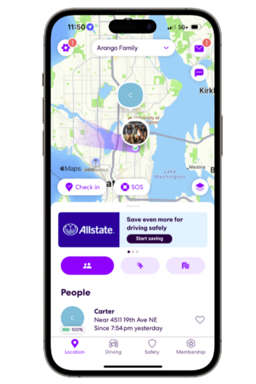
Understanding the Current Experience
Offers were primarily hidden in an inbox-style “Offers” tab
Banner ads in other areas led to banner blindness and low engagement
Ads lacked contextual framing, making personalization invisible to users
Users had no clear mental model for why they were seeing certain offers.
Other areas advertisements were positioned on the app, were leading to banner blindness and ad fatigue among users.
What Wasn’t Working
Images shows current mobile app flow of the offers section.

Image shows Figma designs of Native ads integrated to the platform.
Research & Exploration
Drawing from industry best practices and my background in digital marketing, I explored:
Native, display, and interstitial ad formats
How leading mobile products integrate monetization without degrading UX
Scenarios where ads appear at natural transition points
Market & Pattern Research
Key Insights
Ads are most effective when they:
Appear during natural pauses in a user’s journey
Are explicitly framed as relevant to the user
Feel like a continuation of the experience, not an interruption

Image shows initial research done on Mural.
Rather than increasing ad frequency, the strategy focused on:
Context over volume
Clarity over persuasion
Intentional placement over visibility
This reframed the question from “Which ad performs best?” to “Where does advertising naturally belong within the Life360 experience?”
Strategy
Design Solution #1: Carrier Ads Integrated as Native Cards in the “Driving” Section
Native carrier ads were introduced as cards within the “Driving” section to align offers with a user’s current context and intent. By embedding ads alongside driving insights, offers feel more relevant and informational rather than promotional.
This approach:
Leverages high-intent moments tied to driving behavior
Reduces banner blindness through native placement
Reinforces personalization by visually linking offers to driving data
These designs demonstrate how ads can exist as part of the experience, not on top of it.

Image provides screenshots of current user flow to the “Driving” section of the app.

Image provides wireframe of proposed solution #1.
Design Solution #2: Dedicated “Offers” Menu Within the Driving Section
A new “Offers” menu was added within the Driving section to create a clear, centralized space where users can view their driving score alongside personalized insurance offers.
This solution:
Makes personalization explicit and easy to understand
Gives users control over when they engage with offers
Strengthens trust by connecting driving behavior to tangible benefits
The visual flow highlights how users can intentionally explore offers without interruption.
Image shows Offers section on driving screen.
Design Solution #3: Interstitial Ads When Viewing Driving History
Interstitial ads were introduced at natural transition points when users navigate to view their driving history. These moments represent a pause in the user journey, making them well-suited for high-impact messaging without disrupting active tasks.
This approach:
Captures attention during low-friction moments
Reduces ad fatigue by limiting interstitials to meaningful transitions
Provides clear context around why an offer is relevant at that moment
The interstitial mockups show how full-screen ads can feel purposeful when timed correctly.

Image shows sample visual interstitial ad for Allstate.
Stakeholder Alignment
Because interstitial ads introduce higher UX risk and production overhead, I created a pitch deck to align stakeholders on:
User impact and design tradeoffs
Experimentation and A/B testing approach
Long-term scalability of new ad formats
This helped support leadership decisions around monetization strategy.
Impact
Due to NDA constraints, detailed metrics are abstracted. Outcomes included:
A scalable framework for context-aware ad placement
Improved clarity around personalization and relevance
Direction for future experimentation and monetization efforts
The work positioned advertising as a product experience, not a layer added on top.
Thank you for checking out my work. If you want to know more about my design process, or if you want to talk about a cool idea, don’t hesitate to reach out.
Contact
SOCIAL
lpatelcreations@gmail.com